I’ve been getting a lot of nice feedback on the backgrounds in Petra’s Call, so I wanted to do a tutorial on how I do them in Photoshop.
A BIG part of my processes for Petra’s Call is speed. Every step needs to be fast. I have about 14 hours a week to write, draw, color and “Flash-up” each episode, which is roughly equal to 2-3 comic pages.
This is the process for doing the mountains, but the same principals apply for the trees, mid-ground and foreground and can also be applied to interiors.
Step 1 – The Mountain Shape.
– Start with a blank image
– Select the whole image (Command/Ctrl – A)
– Fill it with the color of the sky using the Bucket Tool (G) – Name this layer ‘Sky’
– Create a New Layer – label it ‘Mountains’
– Select the lasso tool (L) and with the whole image still selected, cut out the shapes of the mountain. This will be one line going across your whole image.
If you are unfamiliar with the shapes of mountains, look at reference and have it open when you are cutting. Mountains are not all the same, so some reference will help your mountains keep consistent. (the mountains in Petra’s Call are based on the Rocky Mountains)
– Once you have the shape of the mountain selected, fill it with the Bucket Tool (G).
Note: it’s important to have anti-aliasing off with this process to allow for clean selections and editing later on.
For a background color, I will take a color from my palette (I use my own preset palettes) and reduce the saturation and increase the lightness. (Color adjustment set to HSB Sliders)
As objects go into the distance, they loose saturation and contrast – even with a basic image like this, desaturating the color for things in the distance helps push them back in the image.
Now you have your basic shape of the mountain.

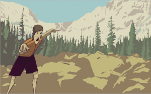
In this particular instance, I wanted the reader to feel surrounded and trapped by the mountains, so I didn’t put them on the horizon, I cupped them across the top of the frame to show that the Oleksyn Valley is surrounded by mountains.
Step 2 – Shadows
– Select the Mountains using the Magic Wand (W).
– With the Mountains selected, you want to cut away EVERY place that is going to have contact with the Sun. This can mess with your mind a bit, but the idea is that you aren’t adding shadows, you are taking away the areas that DON’T have shadows.
The benefit of cutting away is that you don’t have to worry about shadows that are on the edge of the mountain, which saves the time of meticulously lassoing something, or struggling with the magnetic lasso.
– Note: You can hold down the Option Key to continually subtract from the selection.
– Ultimately, you will have a bunch of areas selected.
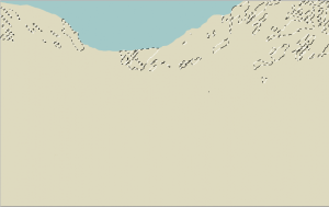
– Create and select a new layer – label it ‘Shadows’
– Select a dark color – generally you shadows to be contrasting the primary light source in your piece. In this case, a very bright mid-day yellow is contrasted by a dark purple. I already have a dark purple my pallet, so I use that.
– Select the Paint Bucket (G) and set the Opacity to 15-20% – personal preference.
– Hit ‘H’ to hide the selection
– Click with the Paint Bucket – this will drop the shadows onto that layer.
– At this point you might want to undo the Paint Bucket to go back and make some adjustments to your selection. Do the shadows look wonky? Are they balanced?
– Once you are confident in the shapes of the shadows you can click to your hearts content to find the right darkness of the shadows.
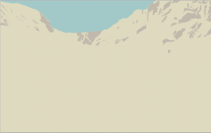
Step 3 – Trees on the mountainside
The shadows seemed a little lonely on the mountain, so I decided to add some trees.
– Select the lasso tool yet again (L)
– Select areas where you want trees, holding down shift to keep adding to the selection.
– Create a new layer – Call it ‘Trees on the Mountain’
– Select a color – I grabbed a green I was planning on using for trees and desaturated and lightened it.
– Use the Paint Bucket (G) at 20% and click to add the trees. You’ll probably have to click a few times, but you don’t want them to be opaque. By keeping them transclucent, you help reduce contrast, which, in-turn helps push the objects into the distance in the image.
At this point, you can repeat the same process for each major layer of depth in the image, increasing saturation and contrast as you get to the front of the image.
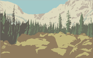
It took me a bit of trial and error to feel comfortable with this process, but right now, a background like this can be done in a little over an hour.
One Reply to “Episode 7 Commentary: Backgrounds on the Quick and Dirty”